ISLAND
Rebrand
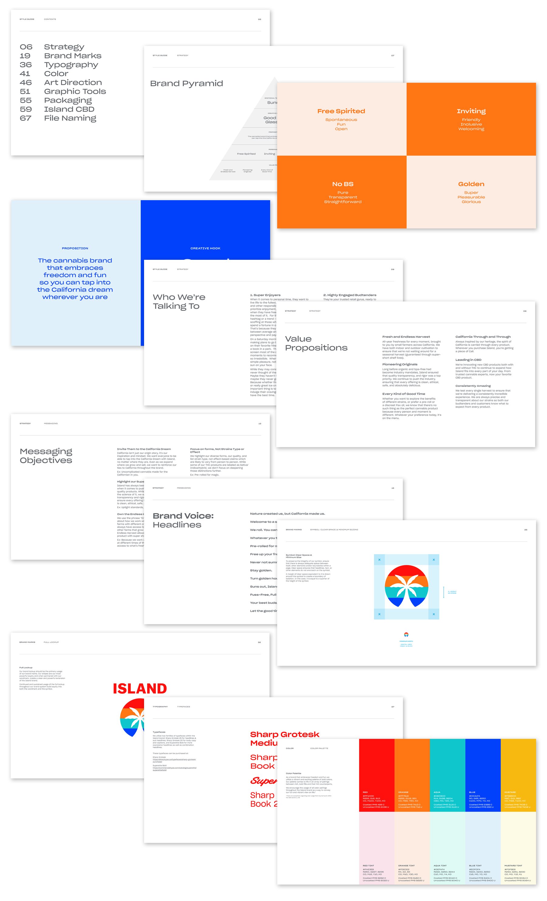
Island Cannabis was founded in 2014, embracing the spirit of 70s California. An early-stage company, they approached me to lead their design team as Creative Director and pilot a rebrand to evolve their visual POV and introduce a new Island with a simple, sunny, straightforward spirit at its core. Inspired by the sun-kissed waves and endless horizons of the Golden State, we updated Island’s brand identity, voice, brand colors, typography, visual look / feel, packaging, retail displays, and website. I directed and guided agency Red Antler on strategy and the creation of a new brand style guide. Collaborating with Marketing, Sales, Product, Retail, Compliance, and multiple international vendors we brought the new vision to life across the end-to-end consumer experience.
Collaborated with: VP Marketing: Lindsay Berg | Director Brand Marketing: Michael Grasewicz | Art Director: Lauren Altieri Caste | Senior Designer: Jorge Valle-Artiga | Photographer/Social Manager: Kristi Camera | Photographer: Victoria Wall-Harris | Sr. Content Producer: Jon Aguon | Videographer/Editor: Darwin Serink | Agency: Red Antler
Packaging
I worked closely with vendors on new packaging form factors and eco-friendly material options. The new packaging minimizes plastic and maximizes freshness. Working with our manufacturers on prototyping, we designed new custom Minis tins with individual heat seals that would keep joints from drying out.


Brand Video
Brand Website
We designed the website to be less complicated and more inviting, with the ability to learn more about cultivation and find and purchase products across any of our retailers.


Island’s Endless Harvest Story
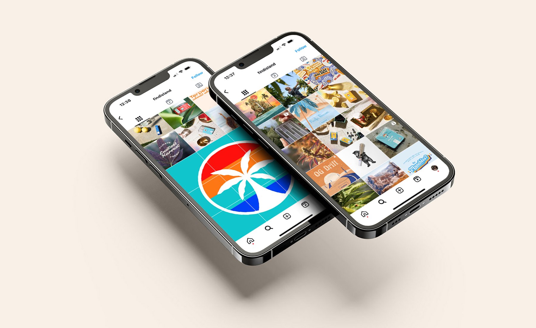
Island works with a network of farmers to grow cannabis indoor and outdoor year-round, giving consumers the freshest flower, no matter the season. We called this value proposition Island’s Endless Harvest and designed an Endless Harvest crest to be used on packaging and marketing materials. To further highlight this in our marketing we traveled to farms across the state and created content videos, allowing budtenders and consumers to meet the farmers who grow our cannabis. I wove the cultivation story into our social strategy, creating video and photo content that highlighted our farms. We created marketing materials for budtenders spotlighting each of our farm partners, so they could better inform customers in-store on a product’s origin.


Packaging Icons
If there is one thing Island is serious about, it’s their commitment to quality, safety and product freshness. They rigorously test against the five-pillar grading system, ensuring it’s consistently clean and delicious. Driving towards Island’s goals to make cannabis simple and approachable, I worked closely with the VP of Marketing to illustrate an iconography system that clearly conveyed the brand’s commitment to the safest, cleanest flower.
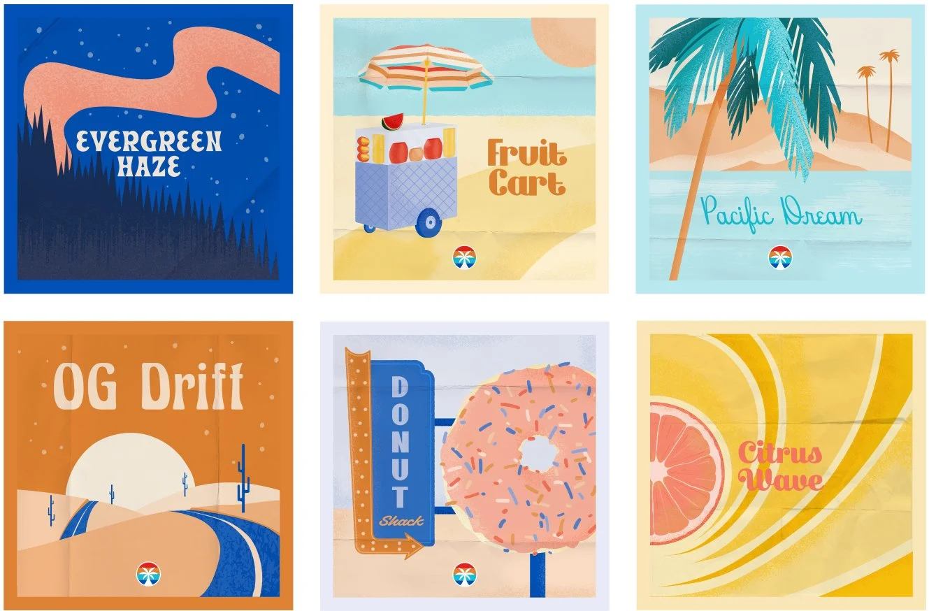
Strain Standardization
We also saw the rebrand as an opportunity to solve retail challenges and make our products more straightforward and approachable for consumers.
The Problem: In the past, stickers with the strain names were printed and placed on the back or bottom of packaging, so budtenders and customers had a hard time identifying strains. Strain flavors were also often stocked sporadically (specific strains arrived seasonally with harvests and might not return until the next harvest). Strain names (like Trainwreck) didn’t align with the brand’s sunny personality. Many customers didn’t know the difference between a Sour Diesel and a Purple Punch.
Our Solution: We wanted to make choosing a strain easy, so we worked cross-functionally with the product development and cultivation teams to establish 7 standard Island strain profiles that could be purchased in all Island product forms. We brainstormed strain names, illustrated an iconography system for easy identification, wrote taglines and brand copy, and created marketing materials around the flavor names, descriptions, terpenes, and genetic lineage. And since there were only 7 SKUs we were able to print the names on the packaging (rather than using stickers) in a consistent place, which made flavors easier to find on the package and gave the packaging a more premium feel. I baked strain standardization into the social strategy, creating content that served as easy guides for customers to choose the right experience for them.