
Branding
Logo Design
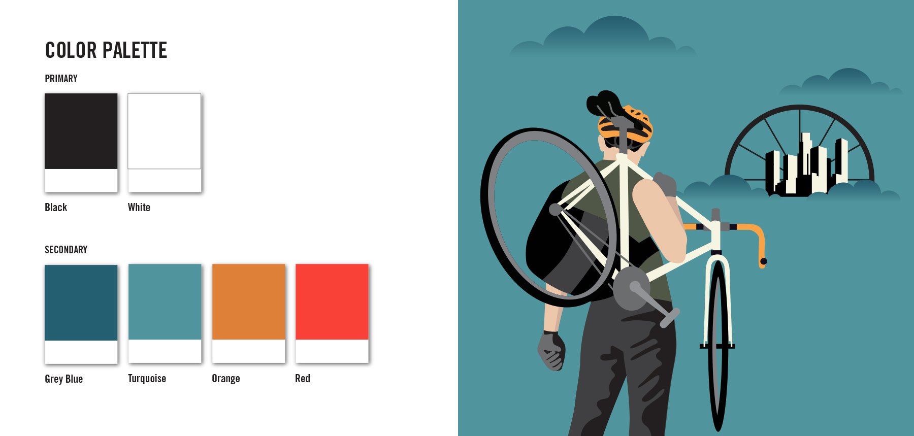
COHEN LAW PARTNERS
In a city dedicated to cars, lawyer Josh Cohen is dedicated to cyclists. A personal injury attorney specializing in bike law, Josh has won his clients millions of dollars in settlements. An avid cyclist himself, he is a board member of the California Bicycle Coalition and lobbies federal, state and local governments to implement legislation and infrastructure that protects vulnerable road users.
Josh asked me to help strategically brand his law firm - Cohen Law Partners - to appeal to his target clients: urban cyclists. Many Los Angeles attorneys claim to be bicycle lawyers, but Josh truly understands the challenges cyclists face on the road every day because he sees it firsthand on his own bike. Josh's branding and website needed to stand out and showcase his passion, knowledge and expertise.
The concept
A hero to injured cyclists, I positioned Josh Cohen as the guardian angel in the City of Angels. Keeping an urban cyclist aesthetic in mind, I wanted to create a logo that was graphic and bold and could be used as a fashion mark on cycling swag. Inspired by street art, I designed a vigilante, winged cyclist logo. A cycling angel to stand up for injured cyclists and take on infrastructure legislation.
Additional work included: UI website design, iconography system design, brand illustrations, stationary system, photo shoot art direction, promotional product design, ad design and OOH bus ad design.


RESPONSIBLE ROOTS
A humble, family-owned chocolate manufacturer who produces premium chocolate and confectionery coatings, Clasen Quality Chocolate works closely with major food companies to create products such as ice cream bars, granola bars, cookies, chocolate covered pretzels, and more. Clasen founded Responsible Roots as a pro-social sustainability program to empower and support cocoa growers. Primarily B2B, this program will be marketed to their partners to aid in their sustainability efforts.
Clasen came to me to design the program’s identity. They wanted their logo to convey a connection to nature and a sense of growth as the program’s mission is to make a difference in the countries their cocoa is grown - to create flourishing cocoa communities by improving farmer’s livelihoods, increasing incomes, preserving natural resources, and creating opportunities for women and youth.
The concept
To create that positive feeling of growth, I used the symbols of a tree, roots and branches in the logo. Roots are life giving, nurturing the growth of a strong tree. Powerful and resilient, they find a way around obstacles and provide an anchor that helps a tree weather the storm. Roots are interconnected, capable of forming root systems that support other trees and the forest’s ecosystem, leading to flourishing forests. Similarly, Clasen works together with their B2B partners to accomplish sustainability goals. And humble and behind-the-scenes - like Clasen - roots are often unnoticed but serve the purpose of allowing for the tree to achieve its beauty and purpose. Branches have an uplifting feeling of growth and hope. With the possibility of extending into many directions in the future. Just as the Responsible Roots program aims to make a lasting difference in cocoa origins, trees are generational, nurturing the growth of future forests.
I created a tree by reflecting the root system to create branches. The symmetry gives the logo a balanced feel. I made the lines organic to connect it to nature. As farmers and their families are at the heart of cocoa, I placed the tree into an organic cocoa pod shape.
For the wordmark I chose a sans serif with unique angled bars, rounded corners and upright characters that felt positive and thoughtful.
Work included logo, style guide, and trade show materials

’AWA’Y MALIBU
’AWA'Y Malibu is an environmentally conscious, safe sanctuary that invites people to recharge, explore, contemplate, and forge deeper connections with themselves, one another, and nature. Founded in 2021 by Tommee May, ‘AWA’Y Malibu was born from Tommee’s own healing journey and deep desire to create a sacred space where the community is able to experience life as a guest on this Earth through healing modalities, earth care practices, and indigenous teachings. The ranch, located in California’s Boney Mountains, is currently offering single day workshops and will grow to offer small-group healing, permaculture education, art therapy, yoga, meditation, and self-care programming and retreats.
Tommee wanted a logo that embodied the holistic spirit of the ranch and vision to create a calm, relaxing space of connection with yourself and the divine earth. The ranch sits on land that once belonged to the Chumash and the name ‘AWA’Y comes from the Chumash indigenous word for ‘moon’. The sky and the heavens impacted every part of Chumash life. The moon in particular is associated with a female god who controlled human health and healing.
The concept
We wanted to honor the Chumash and I thought to incorporate the moon phases - using a full moon to complete the first ‘A’ and half moon as the apostrophe. To illustrate the ranch’s harmonious relationship to the Earth and land I removed the cross line of the ‘A’ to create a triangular mountain shape to represent Malibu’s Boney Mountains where the ranch is located. The full moon rises or sets behind the mountain, illustrating our Earth’s natural rhythms. I chose a san serif typeface for a clean, open feeling. The color palette reflects the ranch’s calming spirit and California climate with warm, earthy tones – sun baked oranges and cool, relaxing ocean blues – with a bit of texture to bring an organic feel.
Work included logo design, UI/UX website design, and marketing collateral.

PERCEPTIVE PARENTING
P.E.T. and RIE® parent educator, Michelle Cescatti, came to me to craft her brand story and help launch her parent education program in Los Angeles. Her brand not only needed to appeal to young moms, but also needed to convey her approaches to parenting – approaches that honor the needs of both parents and children.
The conecept
The two intertwining leaves depict not only the letter 'P' but also the bond between parent and child. The larger leaf nurtures and supports the growth of the smaller leaf. Parent and child growing together, learning, thriving, and ultimately strengthening their roots and relationship. The sinuous lines illustrate that the growth process between parent and child is not linear nor rigid. I chose a clean and modern feel to appeal to her young mom audience.
Work included brand identity, UI/UX website design, photo art direction, stationary system, and promotional postcards.

